To Paint Or Be Painted
- Sep 30, 2025
- 2 min read
By now, my Art For Art's Sake series has reached over 400 cartoons, and I still enjoy mashing things up, a good sign!
As explained in previous posts (*), almost anything 'artistic' nowadays can usually be incorporated in my cartoons.
PART 1:

I really like using paintings/drawings/pictures in which someone (or something!) is caught in the act of creating a 'masterpiece'...
John Ballantyne's portrait of Thomas Faed in his studio is a classic example.

Walter Caspari's cartoon of a young artist being criticized by his professor was also very useful.

This old Betty Boop book (**) cover follows the same principle, but as you can see, it needs a lot of 'cleaning' up!
PART 2:
Ideally, the elements to be inserted should be as different as possible to provide contrast...

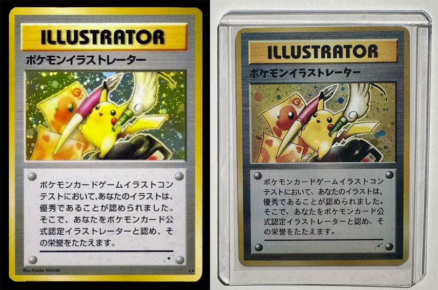
The above Pokémon Illustrator Card is, for whatever reason, a collector's item, supposedly worth gazillions (***)...
Note that I'm showing two slightly different versions, color-wise, here, as colors of all kinds of artwork online are sometimes presented in varying appearances.

I vividly remember the first time I encountered Chris Foss' artwork, amazing spaceships, very impressive...
And Studio Ghibli clearly shows that high-quality animated movies can still be made!

The slightly darker Pokémon turned out to be perfect here; its colors don't clash at all with John Ballantyne's portrait.

Here I aimed for absolute contrast!

The colors of My Neighbor Totoro accidentally matched those of the original dark blue rectangle and 'spilled paint' on the floor.

Getting the edges (of where the two different pieces meet) smoothed out usually takes a bit of time.
For that, I use the 'clone' tool, a highly efficient piece!
Anyway, I hope you enjoyed this brief overview of how I work.
Time for me to finish this post, dump it online, and start concentrating on new AFAS cartoons!
Note: I post daily new AFAS cartoons on:


You are very skilled, Maestro.